
As small business owners, we’ve all seen the trends and heard the stats – so we all know the importance of being found on mobile.
- More than half of consumer time spent on the internet is on mobile devices — Are you where your customers are looking?
- Nearly half of consumers say they won’t return to a website if it doesn’t load properly on their mobile device — Can you afford to lose half of your site traffic?
- 70% of mobile searches lead to action on a website within one hour of when the search was conducted — Mobile users are ready to buy, will it be from you?
And Google’s April update, which we’re calling the Chameleon update, just serves to reinforce what we already know – mobile matters.
But in light of these changes, we’ve been getting a lot of questions about mobile friendly and responsive websites. They all boil down to one essential confusion – what’s the difference between “mobile-friendly” and “responsive” websites?
In simplest terms, a mobile-friendly website is one that can be viewed on a mobile device, like a phone or tablet. This means it doesn’t have any elements on the page (like Flash) that prevent it from loading on a mobile device, or require desktop-only plug-ins to work.
Most mobile-friendly websites were designed for desktop viewing. They happen to work on mobile devices, but they weren’t intended for them.
Here’s the catch – just because a website is “mobile-friendly” doesn’t necessarily mean it is user-friendly. And as a small business, you know you always need to put the user, your customer, first!
Usability issues, like needing to zoom in to read text, click links, or fill out forms, create a negative experience for website visitors using a mobile device.
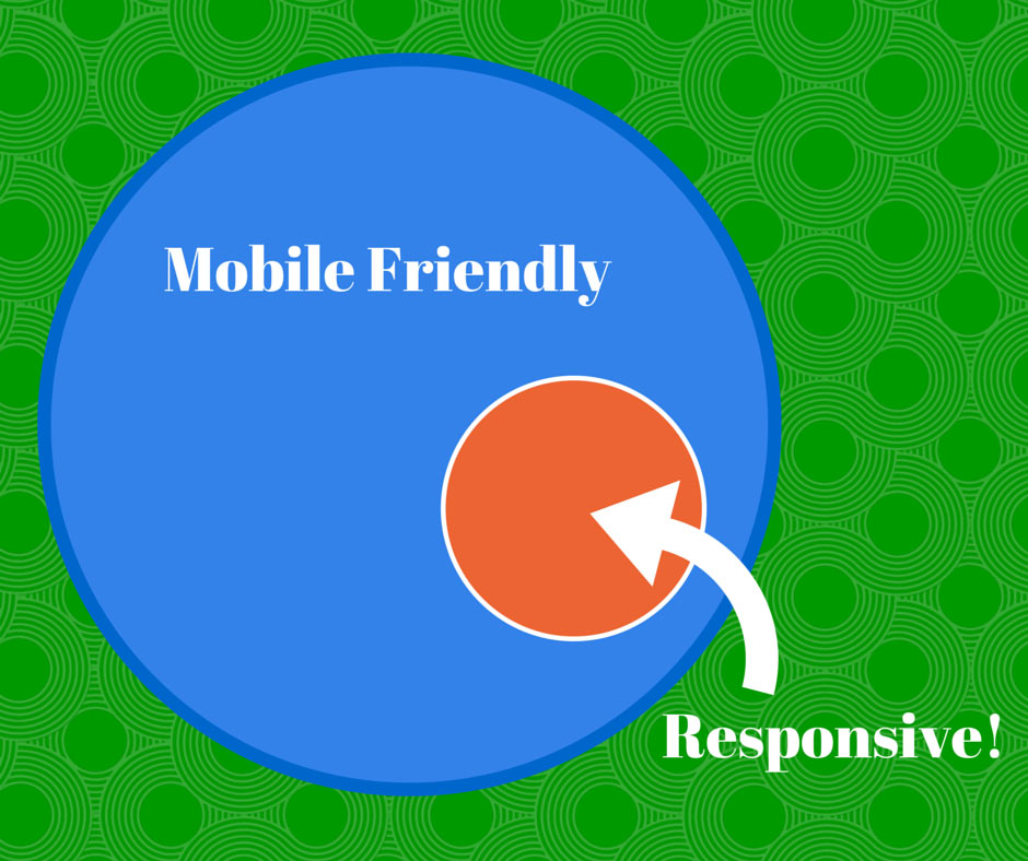
“Mobile-friendly” can apply to great websites and poor ones. The term itself does not tell you enough about the user’s experience on your site. It can encompass mobile-optimized and responsive sites, but also simple sites that just happen to work on a phone.
All responsive websites are mobile-friendly, but not all mobile-friendly websites are responsive.
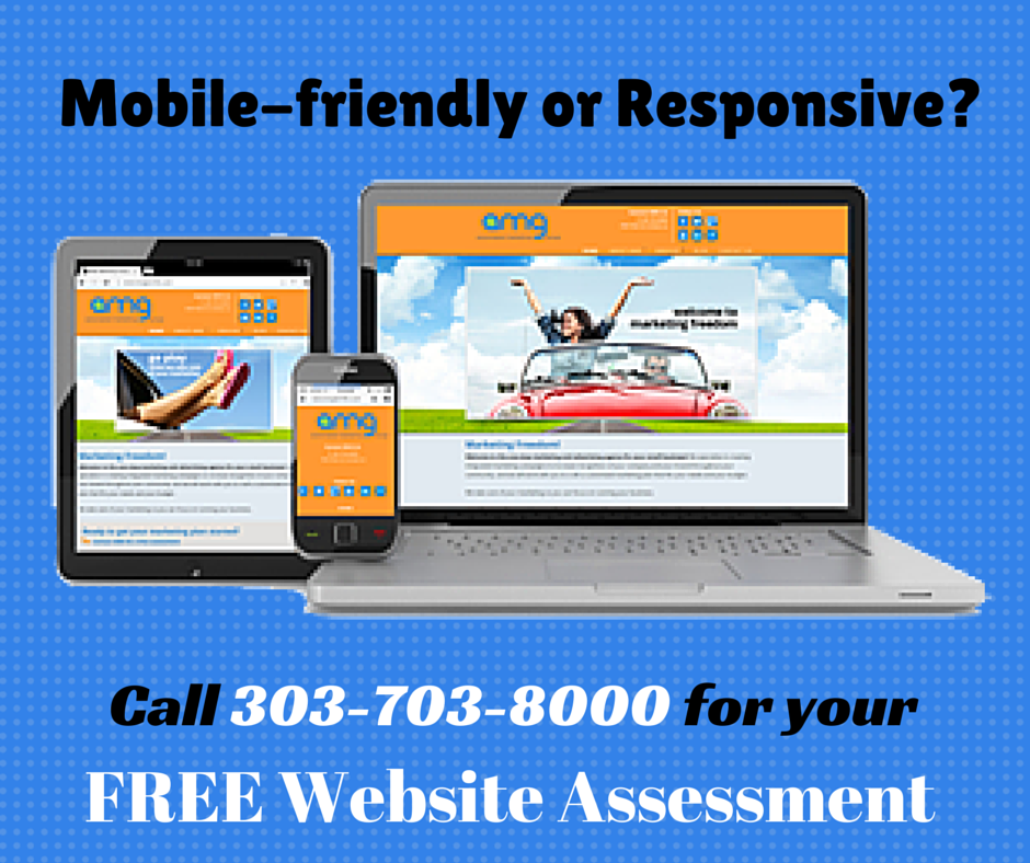
Responsive website design means that pages automatically adjust according to the size of the screen. Pictures resize, buttons move, menu navigation switches, text rearranges – all so you can have the same great experience whether you’re looking at a 2 inch phone screen or a 27 inch desktop monitor.
(If you’re using a desktop, you can see how this works right now! Just grab the edge of the browser and drag it in – watch as the elements on this page automatically adjust!)
The best websites have responsive design incorporated from the ground up – they were designed for both mobile and desktop users. They offer a positive experience, easy to navigate pages, and optimized content for Mac/PC computers, laptops, tablets, iPads, iPhones, and smartphones alike!
Not only are they mobile-friendly, but responsive websites are also mobile-optimized, user-friendly, and pro-business!
Is your site mobile-friendly? Is that good enough? To find out, call our team at 303-703-8000 for a free website assessment, or schedule an assessment online.

Hi Emily and the Team,
Thank you for clarify the difference between “mobile friendly” and “reponsive” websites! Your article is the best answer to my question! I know that my Magento website (I just had it upgraded to Magento 1.9.1.0 in Jan. 2015) is mobile friendly but I’m not sure if the website is responsive, would you please check to see if it’s responsive? If it’s not, can you give me a fee quote on changing the site to responsive? and will the change help me in SEO? Thanks.
Kind regards,
Cindy
P.S: Beside this desktop website, I have a responsive mobile website (curvysea.com/mobile/).
Hi Cindy, Thanks for your comment! I’m glad this helped provide some clarity. Search algorithms are always changing, and the April 21st update put more emphasis on mobile-friendliness. We’ve seen switching to a truly responsive website improve rankings for many small business websites. Our team will take a closer look at your website and reach out to continue this conversation one-on-one. If you have any questions in the meantime, please call us at 303-703-8000. Thank you!