

If you’ve kept up with the business advice and trends across the web over the past couple years, you’ve probably heard that you need a mobile strategy and mobile marketing to stay relevant and competitive. With all this hype, we’ve talked to many small business owners who are thrown into a panic, frozen with fear because they don’t have a mobile strategy.
What is mobile marketing after all? And why is it so important? Where do you even begin with mobile and mobile marketing?
Mobile marketing is important for two main reasons:
- To stay in touch with current and future customers. We learned in 2014 that mobile search, or searches performed on a mobile device (i.e. phone or Tablet), have surpassed traditional desktop and laptop searches. In other words, more than 50% of all searches done on the major search engines such as Google and Bing, are being done from a mobile device.
- To stay ahead of Google’s major algorithm changes. Google rarely, if ever, comes right out and says what changes are coming in their algorithms. But they are pretty good at giving us hints as to what lies ahead for search. If Google knows that more than 50% of all searches are being done from mobile devices (and we know that they do), it’s a good bet the algorithm will change to reflect this tipping of the scale.
So what are some examples of mobile marketing? The first thing you should be aware of (and make plans for now) is Responsive Design as it pertains to website design. Without boring you with all the coding mumbo jumbo, responsive design is building a website so that it “responds” to the size of the screen it is being viewed on.

Whether it’s a 27 inch desktop monitor or a 4 inch phone screen, a responsive website will “auto-magically” adjust itself so the font size, content, navigation, and layout of the site adjusts itself to be easily viewed in an organized and neat fashion.
So why is this so important? First and foremost, responsive design makes your website infinitely easier for your site visitors to view when it has been built “responsively.” Text is easier to read, your site is far easier to navigate, and…wait for it…Google will like it better.
Google has started sending out casual warnings to websites and webmasters that they should seriously consider getting a mobile friendly or responsive website — sooner rather than later. Although it’s not yet known if Google has started “punishing” websites who aren’t mobile, the assumption in most marketing and SEO circles is that there most likely is or will be repercussions for not having a mobile friendly website.
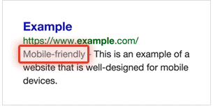
Google has already begun to display the “mobile friendliness” of sites in search results. Responsive websites are labeled, as in the example below, and often appear above non-mobile-friendly counterparts in search results.
But don’t forget that it’s not just Google you are trying to please…it’s really about giving your site visitors the best possible experience when they come to your site. Responsive and mobile friendly websites make it easy for visitors to quickly and easily find the information they need on your website. If your site is difficult to navigate or takes too long to load, people will leave your website in the blink of an eye (and having a high Bounce Rate will also negatively impact your SEO efforts). If you make your website friendly for your visitors, you’ll also please the search engines.
If it’s been a while since your website was built, in the past 2-3 years or older, it’s worth checking the mobile friendliness of your site before your rankings start to suffer. We can quickly assess for the mobile friendliness of your site, so don’t hesitate to reach out to us.

It’s not quite the time to panic, but if your site isn’t mobile friendly you are likely missing out. You’re risking current customers being frustrated with a slow site, potential new customers giving up before they reach your site, and your competitors’ mobile friendly websites vaulting above your site in search rankings. It’s not worth the risk – get ahead of them now, create a responsive and user friendly site, and start reaping the rewards in relatively short order!
Read the story of how a Pediatric Clinic decided to get mobile with their website, and some stunning before and after photos comparing their old site to their new one here.
To find out if your site is mobile friendly or to claim your free assessment of your website, call our team at (303) 703-8000 or email us at contact@LongTermFix.com. We’ll provide you with an overall assessment of your online digital presence – at no cost to you, we’ll offer our advice and expertise to help prepare your business for online success.