
 The tech and social media website Mashable has declared that 2013 is the “YEAR OF RESPONSIVE DESIGN.” But what IS responsive design? And is it either practical or necessary when looking at features for a small business website?
Without spoiling too much of the rest of the article, the answer to that second question is YES. But let’s dig in and find out why it’s so important.
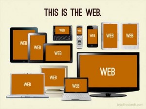
When I first got a copy of Microsoft Front Page ’97 back in the late 1990s, computer monitors were low resolution, and smart phones and tablets didn’t exist. Your website only had to look good on those big, boxy monitors, which really only had one resolution.
Fast forward to today, and not only do monitors come in all shapes and sizes, but now smart phones and tablets make up a huge segment of internet users. And what’s more, every smart phone and tablet has two screen sizes — horizontal and vertical views — that web developers have to consider.
Responsive design is called “responsive” because it responds to the size of the browser. (It’s sometimes called “reactive” design for the same reason.) The goal is to make it look equally good across all types of devices, from a huge desktop monitor down to an iPhone and everywhere in-between.
Of course, that’s easier said than done. When a web site has multiple columns, headers, footers, sidebars and more, you can’t just make everything skinnier to fit it on the screen. It doesn’t take much to narrow a paragraph down so much that
each
line
only
has
a
single
word,
which
is
hard
to
read.
Instead, responsive design is all about how to shift elements on the page around as the screen gets bigger or smaller. To see what I mean, try resizing this website and see how elements are shifted around depending on how narrow the page gets.
It’s exciting technology, to be sure…but is it something that is even practical or necessary for small business websites?
I gave away the answer already, of course. The answer is absolutely yes.
If your website is only designed for desktops and laptops, chances are it doesn’t display or work correctly on smaller screens like smartphones or even tablets. As somebody who uses both a smartphone and a tablet on a daily basis, I can’t tell you how frustrating it is to zoom way in and swipe back and forth just to be able to read the text.
Adding responsive design to your website means that it will be easy to use and easy to read on all screens. Eliminating the frustration of your potential customers can mean more potential sales.
But like all things, wanting to reach more customers and provide them a better user experience is only half the battle. Does a responsive design require a complete, from-scratch redo?
The answer is: it depends.
Older websites were built using “tables,” which is like trying to create a work of art by putting pictures and text into an Excel spreadsheet. It was great for keeping things organized, but absolutely terrible from a design standpoint. No amount of design is going to make an outdated, table-based website responsive because the tables themselves aren’t responsive.
Newer websites have gotten rid of tables (except to actually show a table of data), which means that in many cases responsive design can be added afterwards.
The question, of course, is “are you keeping your current site’s back end for a particular reason?” Because if you’re considering upgrading to responsive design, it’s worth considering upgrading the back end of your website as well.
Content Management Systems — we prefer WordPress, but there are many others — make it easy for you, the business owner, to maintain a blog or post updates without knowing HTML or CSS or worrying whether you might break the entire website.
When we build websites, either from scratch or as an upgrade, we always recommend moving over to WordPress. It has a built in affinity for responsive design, high quality WebPresence™ team can integrate social media and your company’s website.
All of this talk of responsive design begs the question: what’s your favorite example of a website using responsive design? Mashable offers a great example of responsive design, and the fan-run collection of sports blogs, SB Nation, also offers a terrific experience across all browsers.
What are your favorites?
Your blog is very informative. However, it is pretty hard task but your post and experience serve and teach me how to handle and make it more simple and manageable.